What Happen to Font Sizes with Relative Page Width Units
What Happen to Font Sizes with Relative Page Width Units? - CSS Tutorials - Page Layout and Background Image Design
✍: FYIcenter.com
If you set your page width to relative length units like pixels, what will happen to font sizes? Usually, font sizes have absolute length units like point (pt). If you specify font sizes in points on pages with pixel widths, visitors with different browser resolutions may see your texts behave differently.
The HTML and CSS code below gives you a good example of setting font size in points:
<html><head>
<style type="text/css">
BODY {background-color: gray}
DIV.page {background-color: white; width: 730px;
padding: 25px; text-align: left}
HR {width: 730px}
P {width: 730px; font-size: 12pt}
H1 {font-size: 24pt}
</style>
</head><body><center><div class="page">
<p>
<img src=fyi_banner_blended.jpg width=728 width=90>
</p>
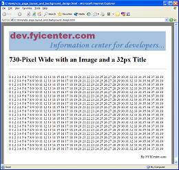
<H1>730-Pixel Wide with an Image and a 24pt Title</H1>
<hr align=left>
<p><script language="JavaScript">
for (i=0; i<20; i++) {
for (j=0; j<40; j++) {
document.write(j+' ');
}
document.write('<br/>');
}
</script></p>
<p align="right">By FYICenter.com</p>
</div></center></body></html>
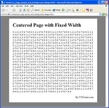
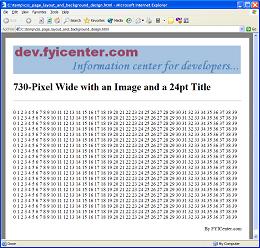
Save the code in 24PointPageLayout.html and view it with IE on a 1280x1024 screen,
you will see a nice looking page like this:
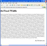
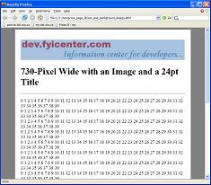
But if you view it with FireFox on a 1280x1024 screen,
you will see your page behaving incorrectly as:
2007-05-11, 5235👍, 0💬
Related Topics:
